Page 1 of 2
New Style DAMN Jerseys - design thread
Posted: Wed Nov 20, 2013 2:25 pm
by Rut Row
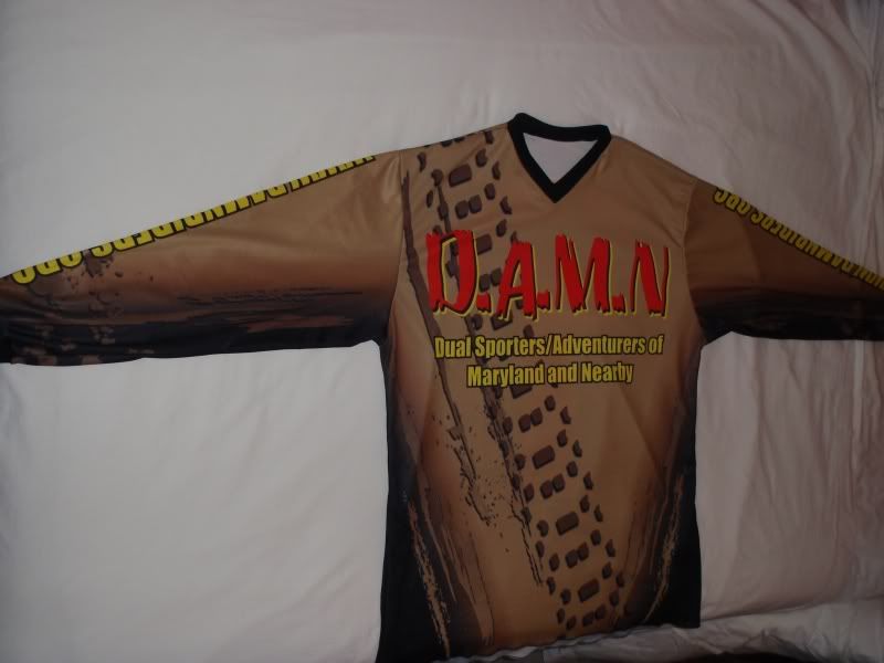
I attached the draft design from the new company (
Xtreme Graphic Designs). He has a BMX/Paintball jersey with mesh sides, cuffed sleeves and a V-neck.
Below is draft version 1. The first change is the border the name aka "player" in yellow. What other thoughts do you have?
 Viewed 4096 times")
- New design version 2
The old jersey design is below.
Re: New Style DAMN Jerseys - design thread
Posted: Thu Nov 21, 2013 8:08 am
by stretchride
Cool! Thanks for all the work Kyler!

A couple minor nitpicky things I noticed...

if the proposed image is dead-on accurate, I have to say I think I like the old version/font of the "DAMN" lettering on the front. The new version is also cool, but almost looks a little TOO beat up, especially that shotgun-blasted N

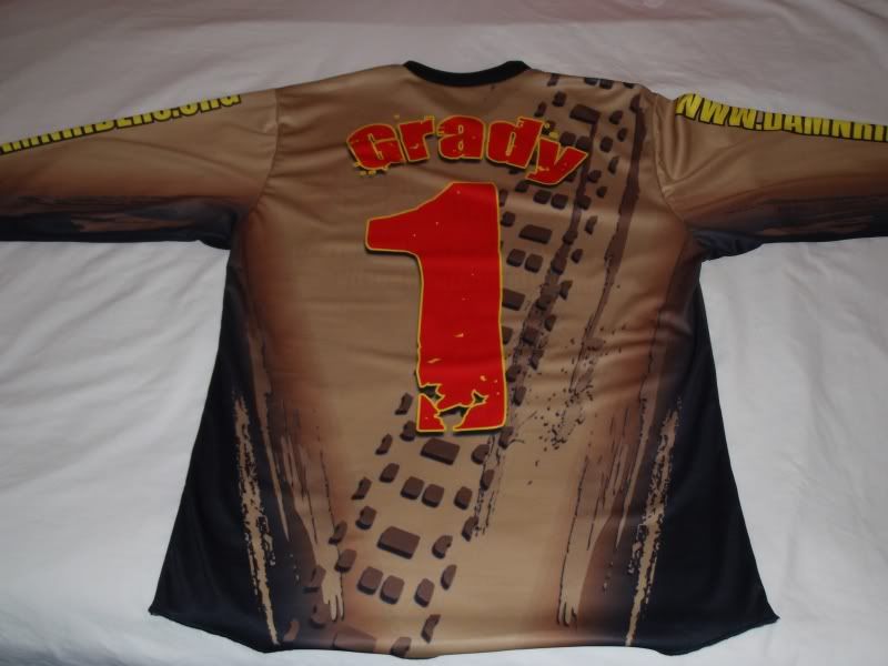
. I like how the old DAMN stretches a little taller toward the neck and it makes me wonder how the new DAMN would look stretched a little taller. On the back I thought maybe the DAMN should get a little smaller and maybe get pushed upward closer to the number. Just thinking the name at the top should be biggest, then the number, then a bit smaller DAMN to preserve that V-shape all our physiques have

Pushing the DAMN upward would just be to keep it from disappearing when tucked and look more integrated with the number.
Just my .02, seriously though looks good and I'll be in for one either way!
Re: New Style DAMN Jerseys - design thread
Posted: Thu Nov 21, 2013 11:28 am
by Laoch

Do we need DAMN on the back?
Looks like it may be tucked in or covered by fannytoolpack/backpack/hyro bladder?
Re: New Style DAMN Jerseys - design thread
Posted: Thu Nov 21, 2013 11:35 am
by Bork
Also a big thanks for all the organizing, but after zooming in, I was wondering about the blasted font also

"KISS" (keep it simple Sam) The older version, easier to read at a quick glance. Is "DAMN" to low in back? (sit on it?) The newer version, no neck line color difference? Is the base color
same? Newer looks greener? in pic. I hope I'm not opening a can of worms, sorry, but you did ask.

Re: New Style DAMN Jerseys - design thread
Posted: Thu Nov 21, 2013 3:48 pm
by phoo
I'm not a fan of the new font for the number '1' on the back. I also agree about the other font being perhaps a bit too grainy for the words. Other than that, everything else has pretty much been said, I think.
Thanks,
~Patrick
Re: New Style DAMN Jerseys - design thread
Posted: Sat Nov 23, 2013 7:12 am
by Rut Row
I updated post #1 with a new pic showing the two different versions.
He's done this so far for free but after this he's going to charge us an artwork charge for more design changes.
I'll let this thread go for a few days then do a new thread with a poll for preference.
Re: New Style DAMN Jerseys - design thread
Posted: Sat Nov 23, 2013 5:48 pm
by Bork
Looks better and legible. Is there a neckline border/bead/hem ?
Re: New Style DAMN Jerseys - design thread
Posted: Sat Nov 23, 2013 6:09 pm
by Rut Row
Bork wrote:Looks better and legible. Is there a neckline border/bead/hem ?
yes, elastic around the sleeves and a V-neck
Re: New Style DAMN Jerseys - design thread
Posted: Sat Nov 23, 2013 9:59 pm
by Bork
The only thing missing is the mudd!!!
Re: New Style DAMN Jerseys - design thread
Posted: Sun Nov 24, 2013 11:51 am
by phoo
Much better! Maybe the D.A.M.N. could have a more "square" font like the first one, but it's fine the way it is.
Thanks for setting this up!
Patrick